Not many live sports going on these days. Will we be able to pick the NFL helmets like some people do in fall and win prizes from the weekly pick-em pools? Crossing my fingers and toes hoping that football does come back this fall with the virus still looming. I had some time to rank the helmets in the entire NFL from best to worst. This is based on looks and looks only. So Green Bay and Dallas are not automatically in last. I found doing this that many helmets of the past are much better than the present. I did notice some teams have never changed their look since day one. Enjoy as I give some reasoning for why I like some, believe others are bland, and some… I question what the hell they were thinking.
#1.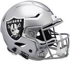
The Raiders helmet is the best in the league. First, we have the silver and black colors. Then the logo of the pirate with a football old school helmet on, with swords in back of his head. It makes the helmet intimating and Fonzie-cool at the same time.
#2.
Fire engine red is one of the best colors in the crayon box. That’s the box with the crayon sharpener. The Chiefs helmet is simple and cool with the KC lettering on the arrow head.
#3. 
The Steelers helmet has the meats. The colors. Black and yellow says Pittsburgh and represents the blue collar steel worker. Now I can go for an Iron City draft while writing this. It’s unique as well, to have the logo on only one side of the helmet.
#4.
The bolt of lightning makes this helmet. The yellow lightning looks great in multiple colors. Like the powder blue helmet the Chargers wear, with the bolt and the number of the player. In the movie The Natural, the Knights put the lighting bolt on their sleeves.
#5. 
The Buffalo Bills have the American flag colors going on. Love the Buffalo logo. Looks like it’s ready to pounce on the opposing team. The Bills’ older helmet that The Juice wore, the orange buffalo, was even better than this helmet the Bills wear presently.
#6. 
They say the Redskins’ name is racist. Which I agree with them on. The Indian logo on the helmet I think is not insulting to Native Americans. I could be wrong. Love the Chicago Blackhawks’ Indian head. Maybe the best logo in sports. I can see the Cleveland Indians logo being insulting. To me, the Cleveland logo looks like Scottie Pippen, more than any Native American. The Redskins older helmet with the arrow and feather is much cooler. Something about Indian logos done well, I always thought they were cool looking like University of Illinois and Marquette University.
#7. 
Saints have one of the best color schemes in the NFL using gold and black. The gold on the Saints helmet is true golden. Not the Packers yellow they say is gold. The Saints logo on the helmet is cool looking and makes me want to head to Bourbon Street right now. I’d be looking for some kind of Hurricane drink on a hot day. Did someone say gumbo?
#8. 
No red bull about it, the Eagles have wings. The wings of an Eagle on the side of those green helmets is very cool. I loved the dark forest green the most, and that put this helmet in my top ten.
#9 
If Ace Ventura can help the Dolphins out, I can admit they have a cool logo. The dolphin is wearing a helmet and leaping in the air with the bright orange sun in the background. Plus, the Dolphins have those typical Florida colors of teal, white, and orange. You expect every Florida logo to have bright colors of some kind.
#10. 
Love the pirate flag on the Buccaneers helmet, but not a fan of the pewter color scheme on this helmet. Cool logo in general. I liked the creamsicle pirate they used to have on their helmets, better.
#11.
Love the falcon beak and eye in Atlanta’s logo. A black color scheme gives this bird a menacing look, like it’s going to pluck your eyeballs out. Would be cooler if the claws were wrapped around a football.
#12 
I tend to like the Seahawks’ original helmet with the bird on the gray helmet. Seattle’s has put in greens and blues with the same bird. What is a Seahawk? A king seagull. I like the green eyes. But the Seahawk looks like the long neck part of an airplane 747. Imagine this bird on a cutting board, like a chicken that’s lost its head. Overall, it’s a cool logo. Just don’t stare too long at it.
#13.
The Arizona Cardinals’ helmet looks like that of the University of Louisville. Or vice versa. What if Arizona made their logo like the St. Louis Cardinals? After all, they were from St. Louis before Arizona. Instead of two Cardinals on a bat, maybe two perched on a football.
#14. 
The Colts logo is simple and to the point. A classic horseshoe. Blue and white colors. Simplicity sometimes is the best way to do things.
#15. 
I do not like the Lion in the wimpy color blue Detroit has. Looks like the Lion is begging for a treat, like a dog begging for a bone on their hind legs. Please give me some more kibble and bits and bits please.
#16.
Have you seen a purple viking? Have you seen a grown man naked? At least you can tell they are horns on the side of their helmets, not like the Rams. I’d rather have the viking himself on the side of the helmet, instead of the horns. Still can’t get over the purple.
#17. 
Did Ohio have a big supply of orange paint back then? At least the Bengals added some race stripes to their helmets, not like the Browns. The stripes of the Bengal give that feeling of wearing orange and black, picking up trash along the side of the road. Everyone loves a good work detail. Ask any Nazi.
#18. 
The star on the helmet is simple and to the point for the Dallas Cowboys. America’s team. I like the blue star on the white helmet, better than the blue star with gray backing. Hate any player who wears the star bonnet on their head. America’s team… I just felt something coming up in my throat.
#19. 
The Houston logo is a battle between a steer, and the shape of Texas. The Texas University with the steer on their helmets is much better than what Houston has going on here. Texas should really make their own country because they really love showing off their state shape.
#20. 
The Carolina Panthers just hijacked the old Michigan Panthers from the 1980’s, OF THE USFL. It’s like that high school that takes some professional sports team logo and uses it for themselves. No artists in the Carolina area?
#21. 
The New England Patriots’ older helmet, by far beats this futuristic Patriot they wear now. Will the Patriots have to change their name since Boston is rumored to be a racist town these days? Maybe it was these savage Patriots that dumped black tea in the harbor at that big shindig of a tea party.
#22. 
If you woke up to find a horse head in your bed, you may be in trouble. If you woke up and found the Broncos head in your bed, you’d just laugh at the retarded unicorn and roll back over to sleep. Maybe if they showed John Elway’s horse chompers in the logo, you’d have something better. I like their older helmets much better than this unicorn with orange hair.
#23.
Tennessee Titans logo looks like a flaming comet with a retarded sword. Titans now have darker colors instead of that powder blue and white. You had me with the oil rig before you left Houston.
#24.
The Ravens are the worst bird-type logo in the NFL. The bird looks like a purple crow. All you need is a gang of bikers from Sons of Anarchy to come roaring by and turn this Raven crow into road kill. Remember the show Scarecrow and Mr. King? What happened to Mister King?
#25. 
I like the green the Jets use on their helmet. It just says Jets with a football which is kind of boring. I’d rather have the concord looking plane with Jets spelled out on the sides, like they wore before those white and green helmets.
#26. 
For years I thought the Rams helmet was just blue and yellow stripes. You have to get the magnifying glass or microscope to see that these are ram horns on their helmets. Like one of those pictures where if you tilt your noggin’ and squint, you can see an image in the squiggly lines of multiple colors. Maybe adding some crank to your diet would help the average Joe quicker.
#27.
The 49ers color scheme is similar to the Winston Lights cigarette packages. It’s a cool color scheme, but the simple SF lettering is what your baseball team has. Maybe a gold-rush miner with a big pick axe would be sharp.
#28. 
The Bears color scheme is awesome. The simple C is boring to me. They could do so much more with their helmet. Their Monsters of the Midway logo they use, would look awesome on the side of their helmet.
#29.
Traditionalists will not like my opinions of the very simple helmet. First of all, some say the Packers helmet is gold. Looks like Tweety Bird yellow to me. Yellow has never been my color with a big G on the side. What the hell is a Packer anyways? Movers?
#30. 
The Giants helmet looks like if the show NYPD Blue had a football team. Why don’t they just put Detective Sipowicz’s bare butt on one side. I like the old helmets better when they spelled out Giants on them, instead of NY.
#31. 
The Jaguars helmet is terrible. The color scheme hurts my eyes. The Jaguar head looks smooshed down like it hit a glass patio door. The smurf blue tongue… Was it eating a blue ice pop?
#32. 
The Browns helmet is the way they played for the last two decades. The lemon of the league. The helmet is actually orange, not Brown. No logo, just an orange helmet. Put a bull dog head on one side at least.