When President Donald Trump speaks, many people may think, “here we go again.”
Some of Donald Trump’s agenda trying to make America better has been wanting to change certain names back to their original. In his second term, Trump has renamed 7 U.S Army bases back to their original names. Some of these military bases were named after Confederate Generals from the Civil War. Some of them were named after other military heroes. For example Fort Bragg in North Carolina was renamed Fort Liberty. Pfc Roland L. Bragg was a World War I paratrooper. I’m sure you can debate all the name changes and come up with pros and cons why former military men need or don’t need a base named after them.
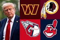
Recently Donald Trump has brought up name changes in professional sports. His thought is that Cleveland should change back to the Indians and dump the Guardians. The Cleveland Indians have been around for 106 seasons. They were pressured to change their name for years and they finally did in 2021. The Guardians ownership does not want to go back to the Indians name. Trump may have more influence on the Washington Commanders franchise. Before the Commanders along with the Washington Football name in DC, they were called the Redskins. They were the Redskins for 83 years. When the pandemic came around and America was at a boiling point of hate, the Redskins became extinct. Now Trump may try to block Washington Commanders ownership from building a new stadium where they used to play at RFK stadium. Trump claims many Native Americans were very proud of the Indian names and logos in sports. It’s the new generation and many people that are not Native Americans are bothered by these old historical names and logos. You can debate this conversation until you’re blue in the face. Many of these old sports logos that were Indian style logos looked amazing. Even some of the cartoon style logos had some character to them. In team sports it takes the entire roster. Many Native Americans in our history books, like American Generals, were warriors, hard working, and had a team concept of how to win the mission. I will throw out my favorites of my top ten little Indian logos. I think they are all cool looking logos as I rank them from worst to first. However worst is still a solid Indian logo. They have made my list. Some of these logos are gone. Some of these logos are still around. These logos come from colleges and professional sports.
#10. KINSTON INDIANS (Minor League baseball)
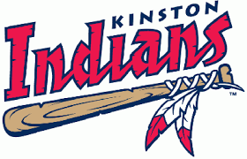
The Kinston Indians existed from 1978-2011 in North Carolina. They were a minor league baseball team and played in the Carolina league. They were affiliated with the Blue Jays and Indians of the MLB in their history. I like the feathers around the baseball bat handle. Now the Carolina Mud Cats play in Kinston.
#9.BOSTON BRAVES (MLB)
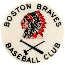
Before the Atlanta Braves. Then before the Milwaukee Braves, the Boston Braves were around from 1871-1952. In 1953 they became the Milwaukee Braves. They were not always the Braves in Boston. Some of the years they had different nicknames. Babe Ruth played his last year in baseball for the Boston Braves. I like the Indian head logo. I love the hatchet and baseball bat below the Indian head. Sharp looking.
#8. WASHINGTON REDSKINS (NFL)
People think the nickname Redskins is a racial name. In the beginning it was not. The name Redskins went down a bad road later in life where people used it as a racial insult. I always liked the arrow logo with features on Washington’s helmets they wore from 1965-69. I like that better than their Indian head they wore most of their years as the Redskins.
#7.JOHNSTOWN CHIEFS (ECHL)

The Johnstown Chiefs were one of the original hockey teams in the ECHL. They played minor league hockey in Johnstown from 1987-2010. They played their home games at a stadium called Cambria County War Memorial stadium. This was the stadium where the best hockey movie was filmed, Slap Shot.
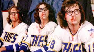
I love the Indian headdress on the logo with the hockey stick and hatchet.
#6. ORLANDO RENEGADES (USFL)

The Orlando Renegades only played one season with the cool hatchet and feathers on their helmets. It was the1985 Spring football league in the USFL. They won only 5 games that lone season. It was a losing franchise before they moved to Orlando. Originally they were the Washington Federals and they were the worst team in the league for years. A new city. New uniforms. A powerful logo could not make them a better team.
#5. CLEVELAND INDIANS (MLB)
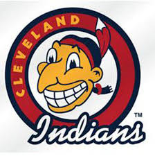
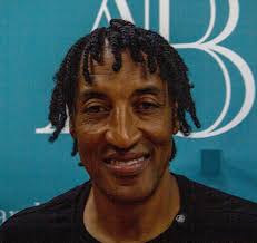
I really do not care what people think but I loved the Cleveland Indians logo. I’m sure many fans loved the Indians logo. I bet many fans still wear their Indians swag at Guardians games. Chief Wahoo is a cartoon character. It’s like going to Great America and getting a caricature done of yourself on a skate board. The Chief looks like former Chicago Bulls star Scottie Pippen.
I’m Irish & I don’t get mad when the University of Notre Dame makes me look like a Leprechaun on their logo. I even have a Chief Wahoo beer sign in the man cave. Not a Cleveland baseball fan, but I did like Indians over Guardians on any day of the summer.
#4. ATLANTA BRAVES (MLB)
I grew up when the Atlanta Braves had their Indian logo. This guy looks like a bad ass mother chucker with the mohawk and a feather coming out of his head.
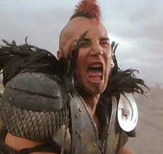
He reminds me of the guy in the movie Road Warrior. He was a villain but had that rally cry down pat. The Braves to me were never a villain type of team. They did have some great teams after the Indian logo. They still hold on to their name today even though they are still being pressured I’m sure to change their name or else. I do like the tomahawk logo they wear now. Too many Braves logos in this one already. Enough is enough.
#3. EASTERN MICHIGAN UNIVERSITY HURONS (NCAA)

I thought that Eastern Michigan Hurons was always a classy style of logo. I loved the color of green they used. In 1991 Eastern Michigan gave in and change their name to the Eagles. I wonder what the stats are of schools going from a Indian logo name to an Eagle or some kind of Hawk. I guess birds are safe these days. Indians and birds have feathers in common. Just wait till the birds have their say.

#2. UNIVERSITY OF ILLINOIS FIGHTING ILLINI (NCAA)
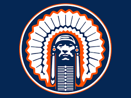
In 2006 the NCAA wanted to remove any Indian mascots that were abusive and hostile. For the University of Illinois they had to get rid of Chief Illiniwek who performed Indian heritage dances at the games in the full headdress and Native American wardrobe. By 2007 Illinois did not have their mascot or their old logo. The Indian logo the University had was amazing looking. The colors blue and orange make that head dress bright on that logo. The term Illini refers to the Illinois confederation, which was a group of Native American tribes that lived in the Mississippi River Valley which the University named themselves after. What an insult to be wanting to name yourself after someone, or some group you respected.
#1.CHICAGO BLACKHAWKS (NHL)
The Chicago Blackhawks is by far one of the best logos in sports. The Indian head with all the colored feathers is a logo anybody can respect. It is a logo which certainly gives respect to all of the Native Americans. The Blackhawks got their name from Chief Black Hawk who was a big part of Illinois history. The Chief was also prominent figure in the Sauk nation. The Blackhawks were one of the original six teams in the NHL. The Chicago Blackhawks do not get the pressure like other teams in sports that still have the Indian logo. The ties go back far with this hockey franchise and the Chief. They may never get severed. I just wish the Blackhawks front office could do a better job at building a winning team so the Native Americans and the rest of us could have something to cheer for on the ice instead of a few cold beers.
